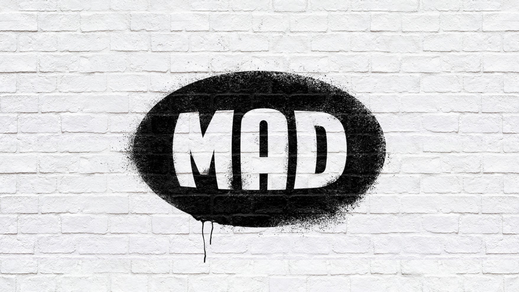
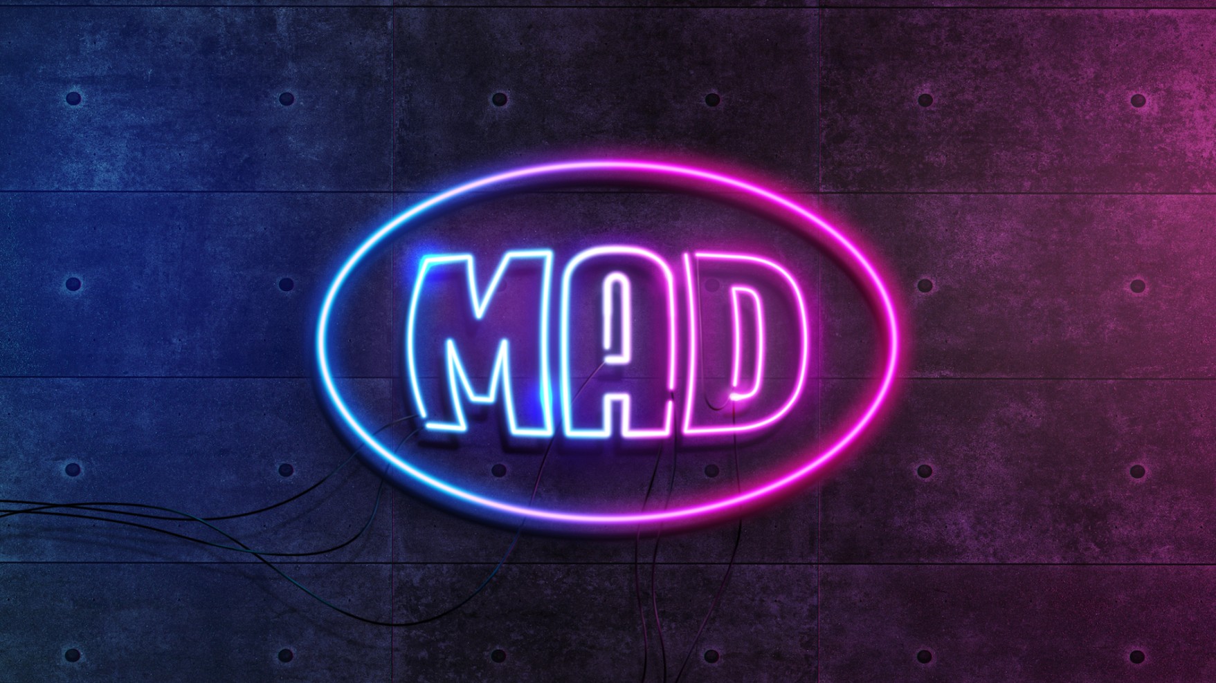
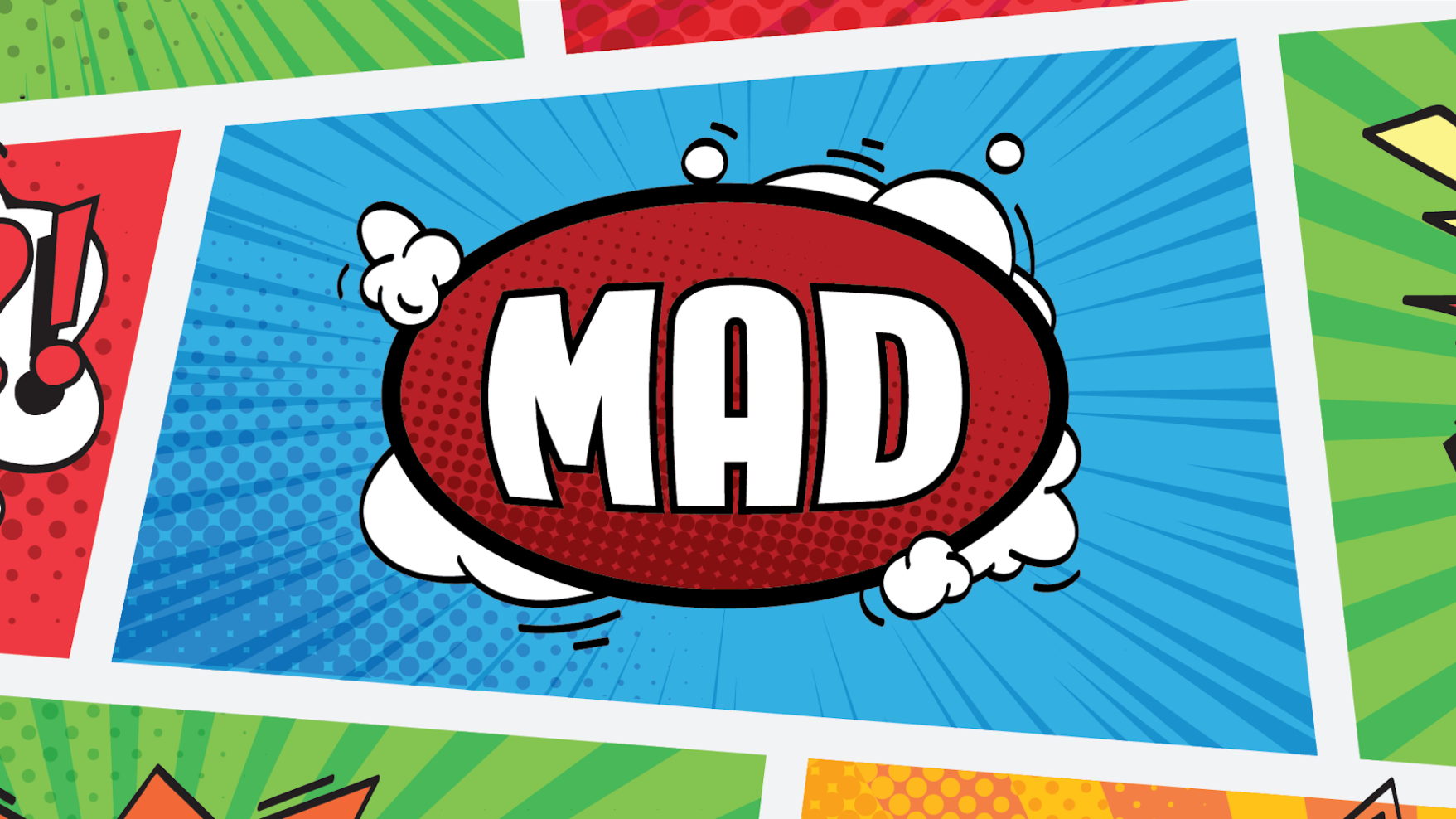
Mad Channel is a television channel that is as famous with Greeks as is its logo. It started in 1996 as the first music channel, combining its name closely with music. Today, its topics cover both musical reporting and concerts as well as current events and entertainment shows, on different platforms.
When we undertook the modernization of the logo in a way it could accept many different applications and speak with a youthful, versatile and diverse audience, we knew we had to approach it with surgical precision so that it would keep its essence. Stay the same but be different.
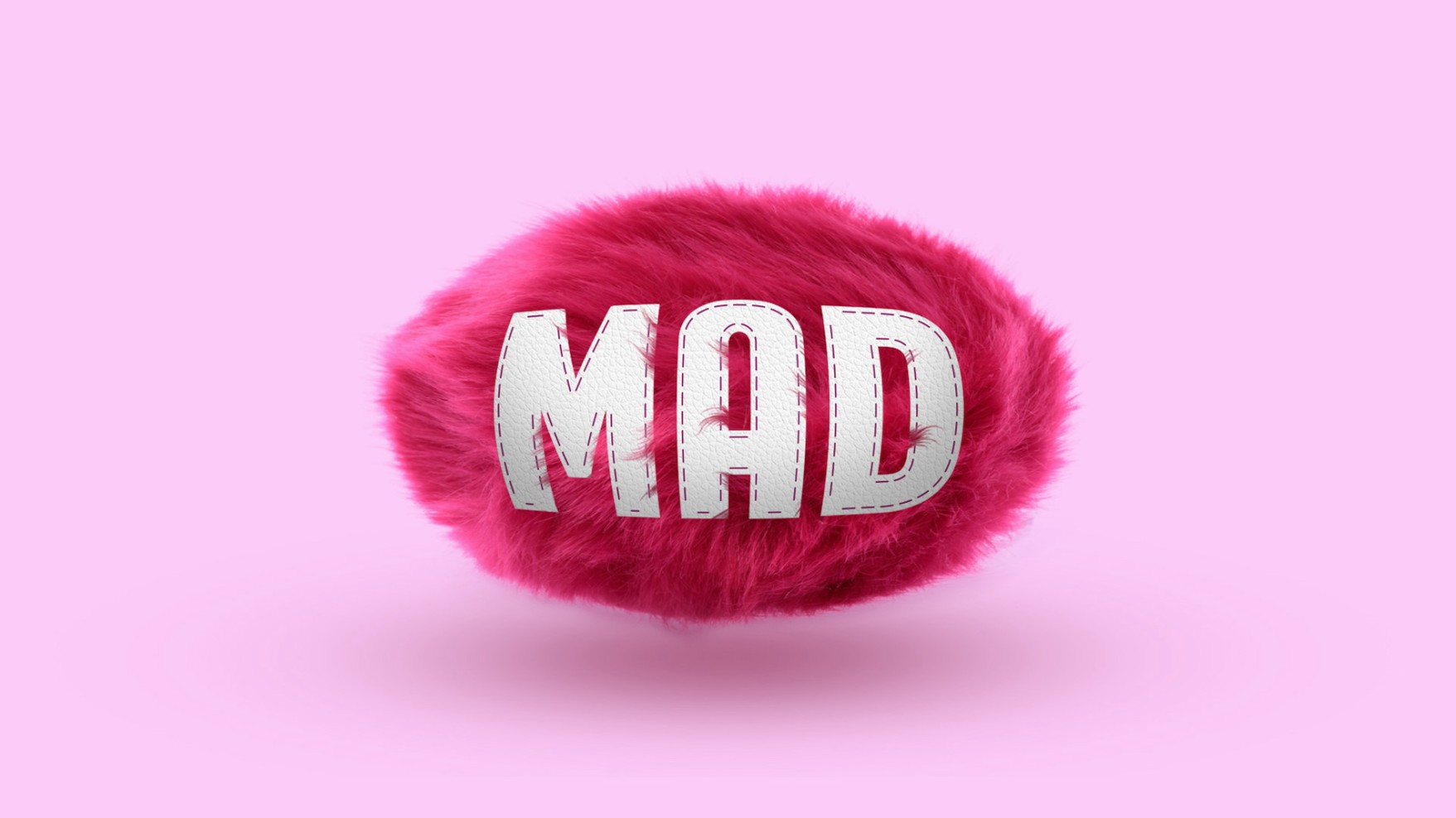
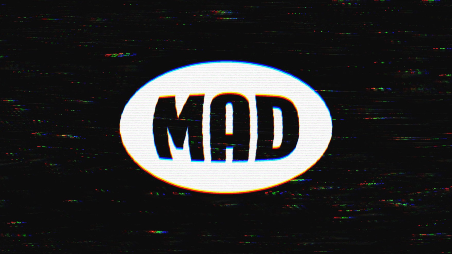
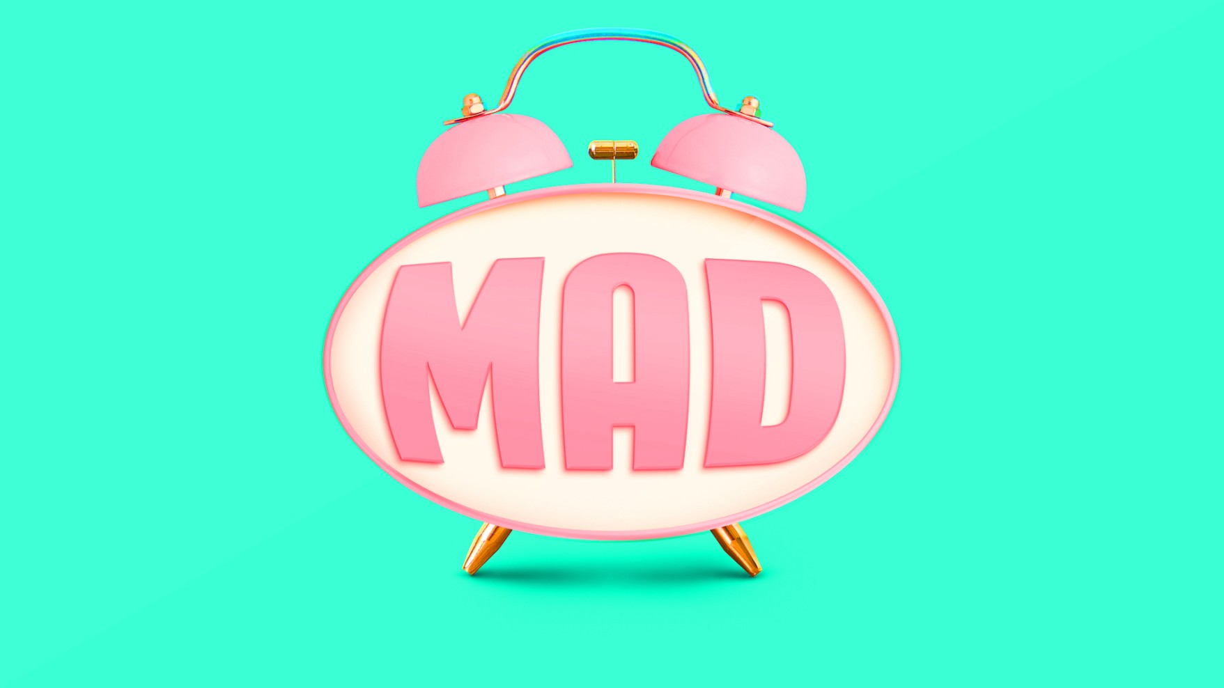
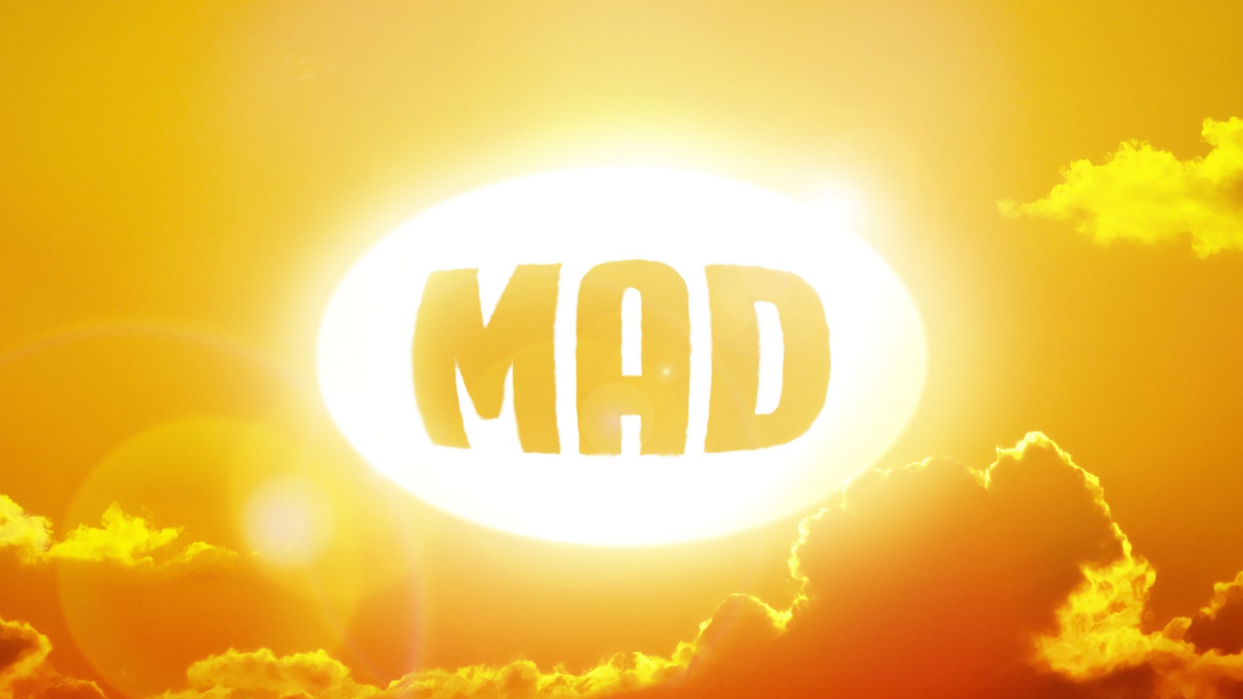
The change had to be such that it would make possible to engulf different styles, programmes, present and future trends while expanding through different platforms, both offline and online, without being altered and without looking foreign.
We treated the logo as a whole and as first step we used the golden rule to give harmony to the oval shape. The second step was to operate on the letters and give them volume by not distorting them but rather adapting them to a perimeter design of the 3D shape and a more contemporary image.
Compact letters created clear volumes and became masks without being distorted. They showed intense adaptability in a polyphonic environment.
The result is a logo no one realizes it has changed, although its transformation has been such that it can accept any application. It’s proven versatile in the changes of its environment, as is music itself, and remains, still today, its worthy ambassador.
