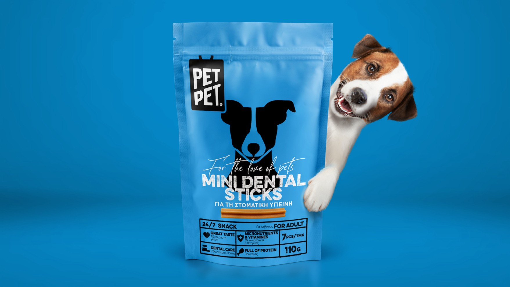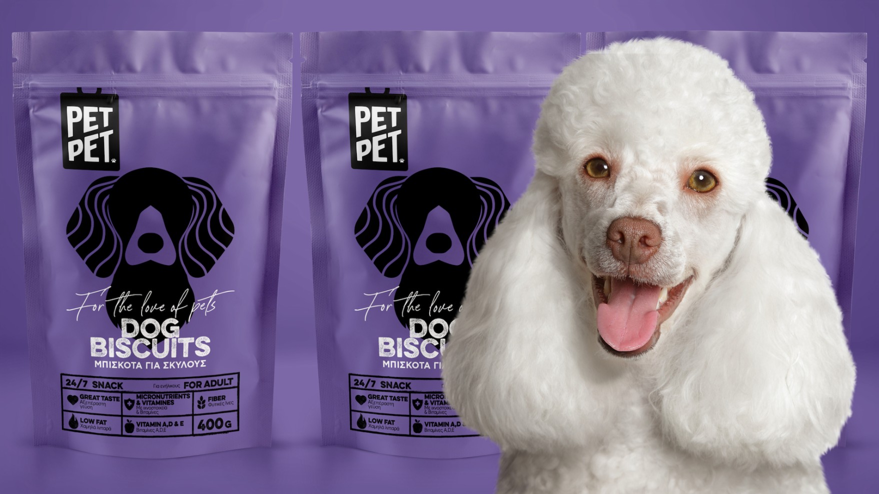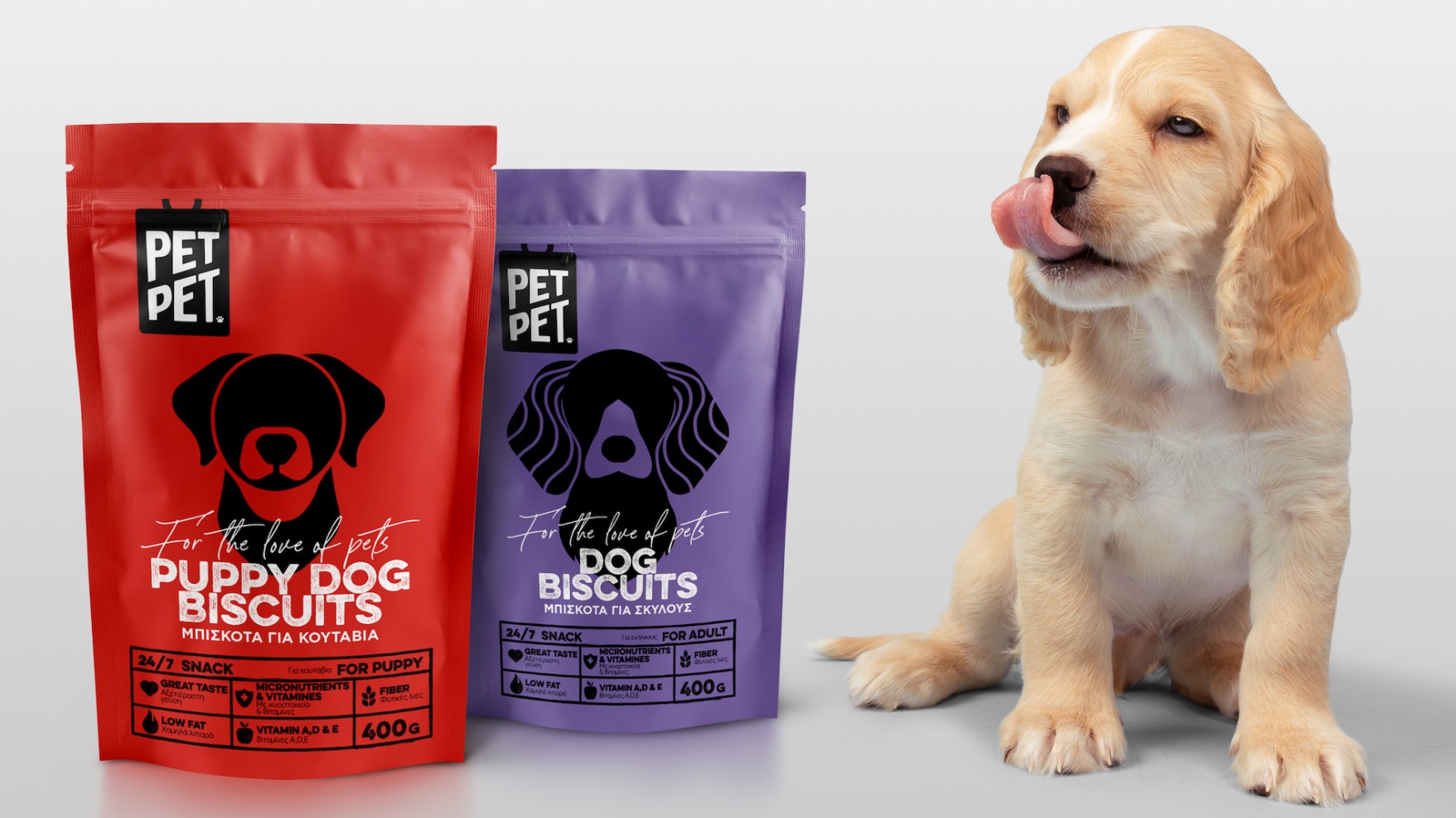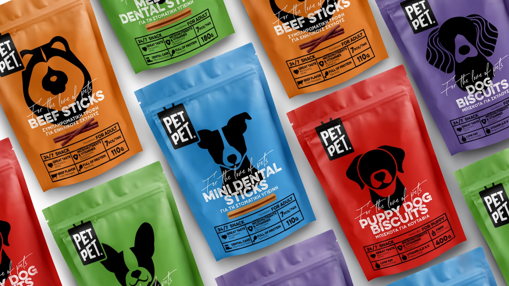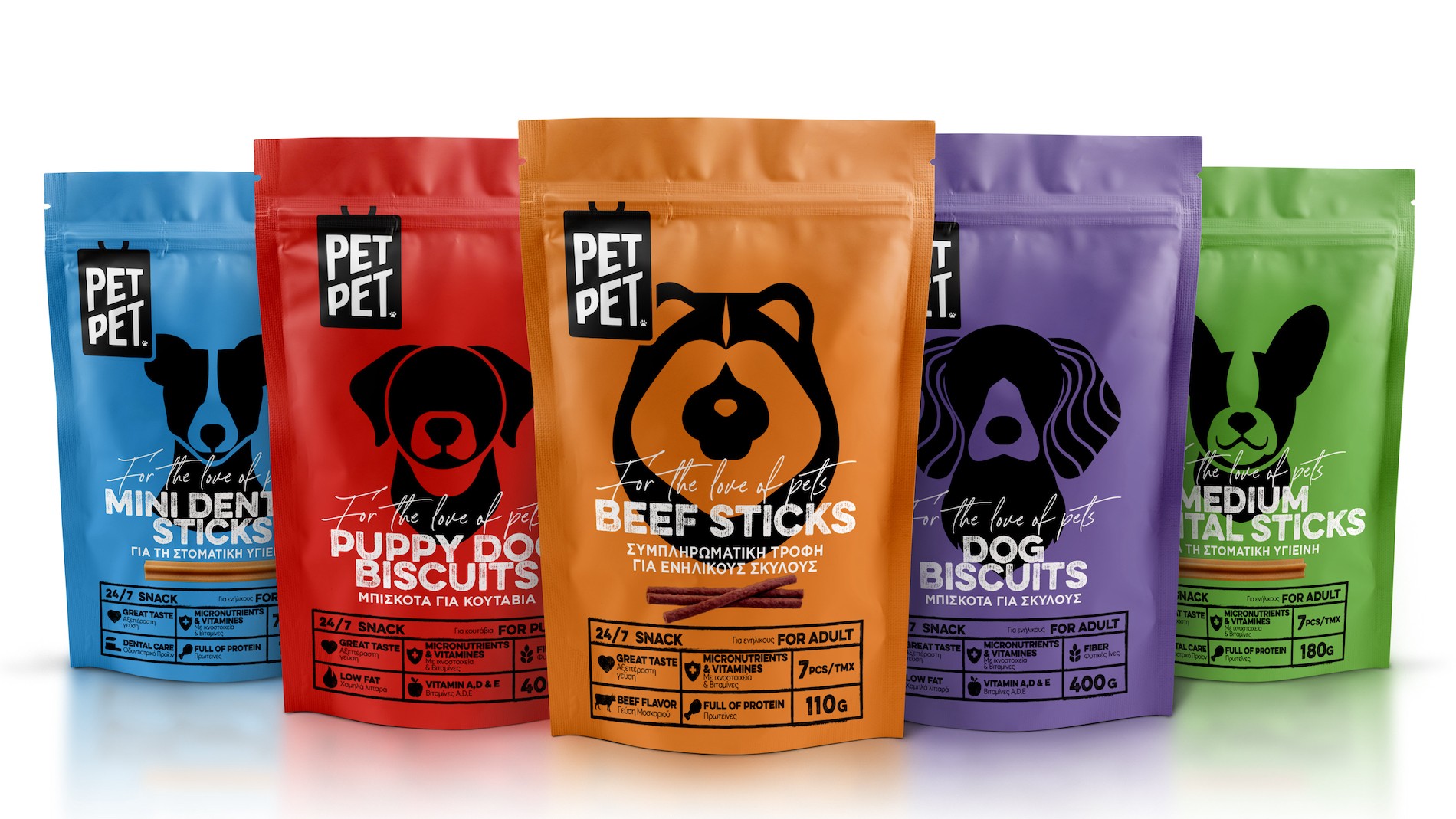


In order for someone to design a series of care products for our four-legged friends, what is needed, first of all, is love. It is love what led us to design a logo resembling an impression of a dog’s identification tag. The tag stamps an animal that belongs, is loved and cared for. It gives the package a name, just like for a pet.
The identification tag stamps the identity of the brand. It’s stamped itself by a graphic paw resembling a ™. As an undoubted element of quality. As acceptance of the brand by a four-legged supervisor.
The meaning of the stamp becomes a design typology that forms a description of the product, written with indelible ink. And then again as an information board that is displayed on first level, conveying a brand of total transparency.
The pop colours of the package, the aesthetics of the intense, single minded colours and the simple graphics - almost infographics - convey joy and a sense of freedom. The linear approach allows for feelings to be free, without guidance or lecture, without promoting a specific breed and without forcing a type of love. The packs create an open, postmodern dynamic on a brand that inspires positive feelings.
| 2022 | Red Dot Awards | Winner |
| 2023 | World Brand Design Awards | Bronze Award | Identity |
| A Design Awards | Silver Award | Packaging Design | |
| C2A Awards | Winner |

