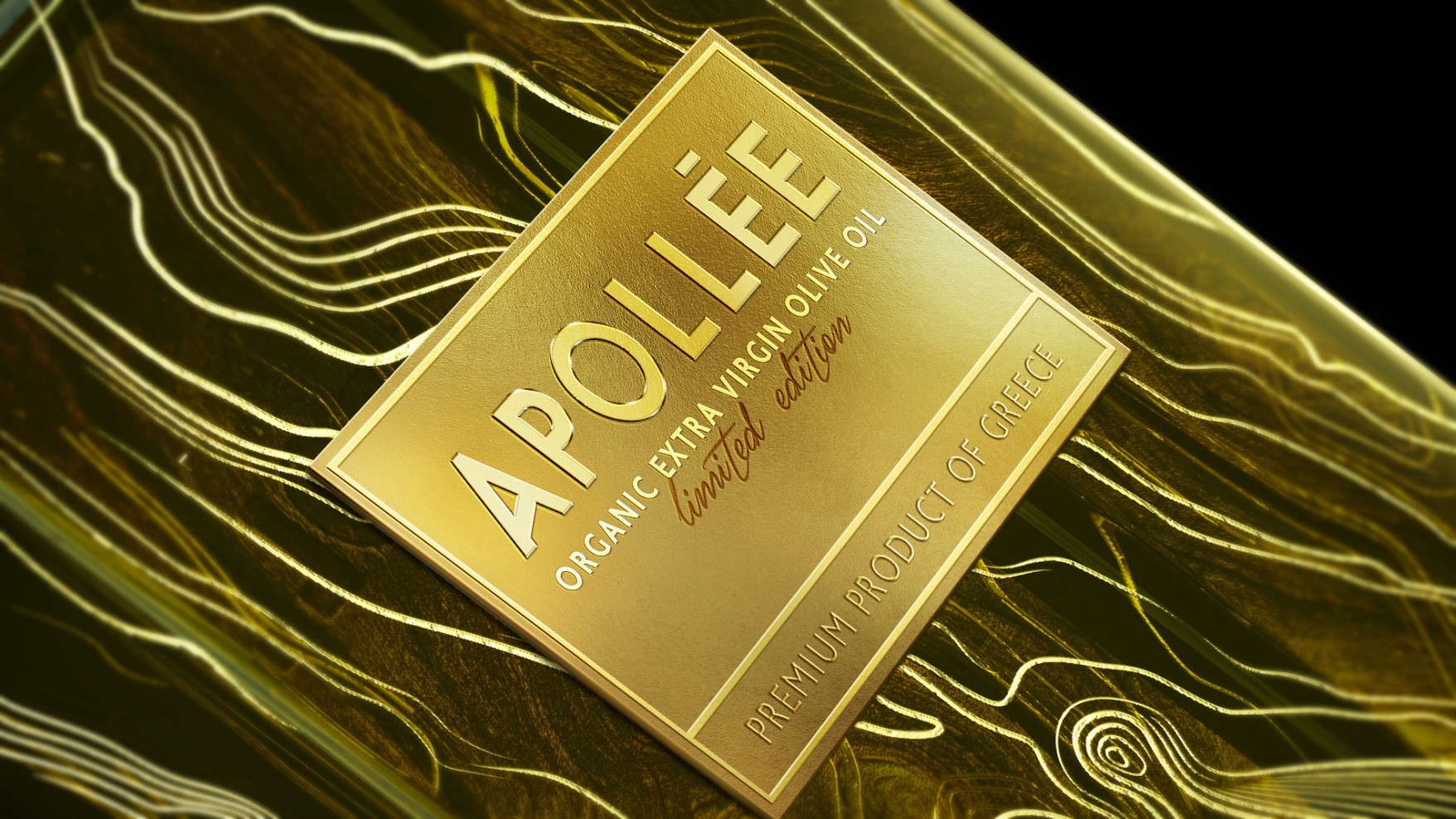


We were asked to create the image of an ultra-premium extra virgin olive oil for a demanding audience, the United States market. A brand with the confidence of its highest quality and Greek origin.
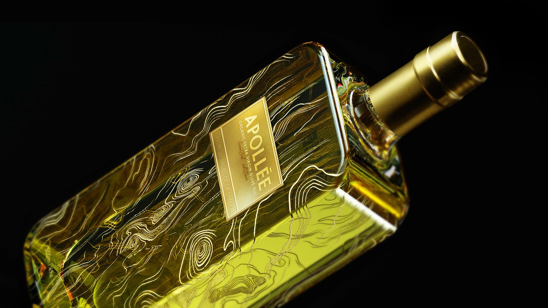
In order to go forward we had to look back to the sun that nourishes the Greek soil and gives life to the olive tree. No wonder we gave the brand the name of Apollo. The sun was imprinted on the product with gold elements. There we had it: Greece of myths and legends and an olive oil of excellent quality.
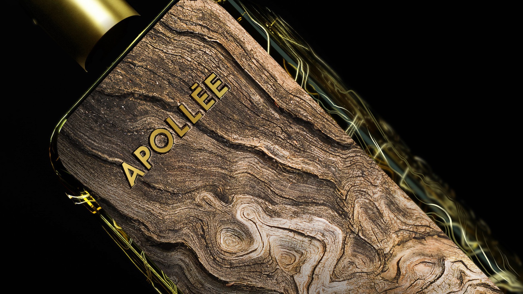
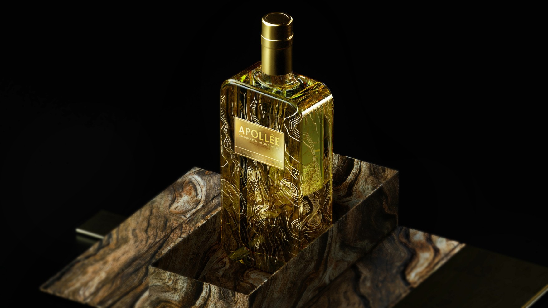
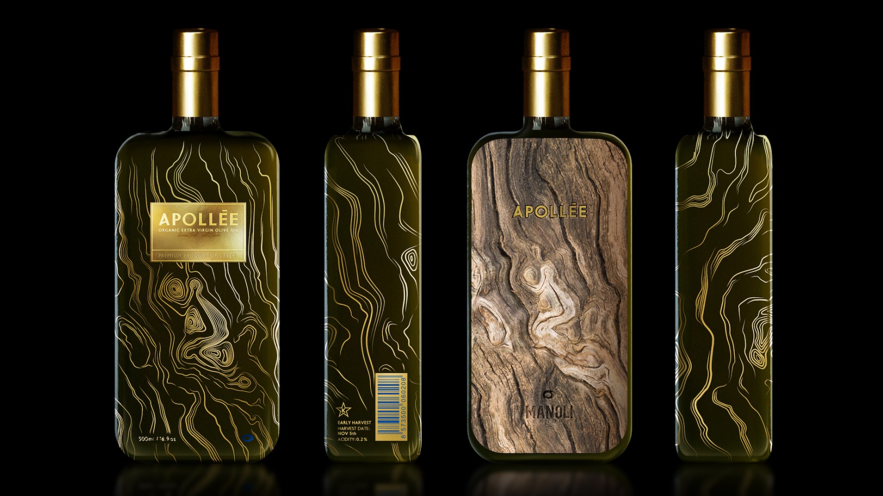
Our gaze followed the life story of the olive tree as each year added one more knot on its trunk. Every knot resembled the wisdom of nature. We waited until its body was covered with knots, until all the knots formed the image of a woman in the position of offering. Until wisdom embraced all humanity and its kindness. Then we printed this trunk onto glass. And we enclosed in the glass the golden juice. The essence. By keeping the back of the bottle reminiscent of its origin: the trunk of the olive tree.
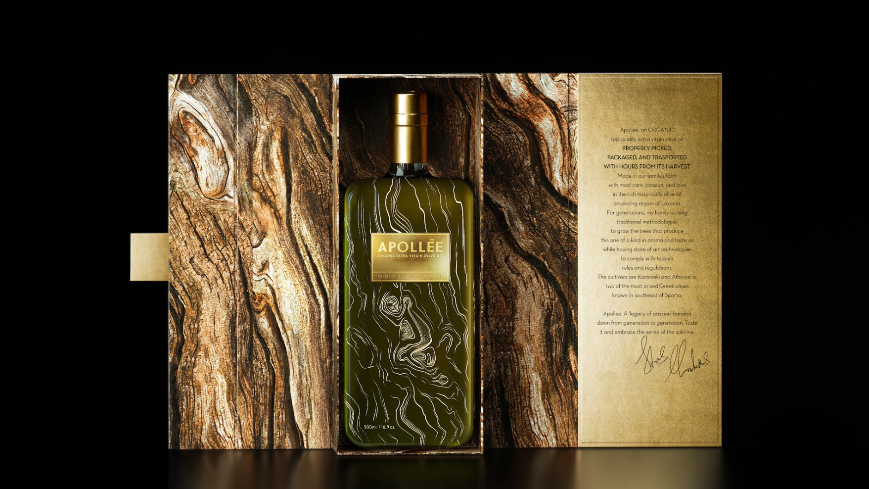
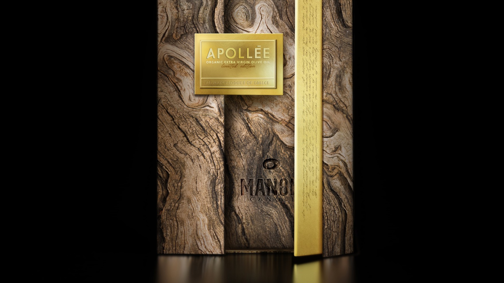
It was a bottle similar to that of a perfume. The perfume of the soil. Precious. And that is why it is protected in a box resembling a tree trunk. The trunk closes within its precious secret with a promise written in ink, hidden, until the moment you decide to open it.
| 2020 | Packaging Awards | Gold Award | Limited & Special Edition Products |
| WPO world star | Winner | ||
| A’ design awards | Gold Award | Packaging Design |
| 2021 | Indie Awards | Bronze Award | Packaging |
| 2024 | Muse Awards | Gold Award | Packaging Design Luxury |
