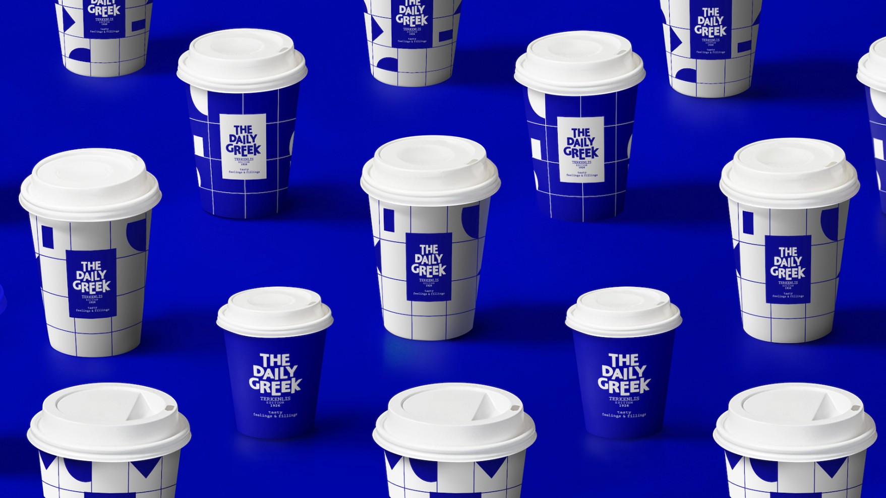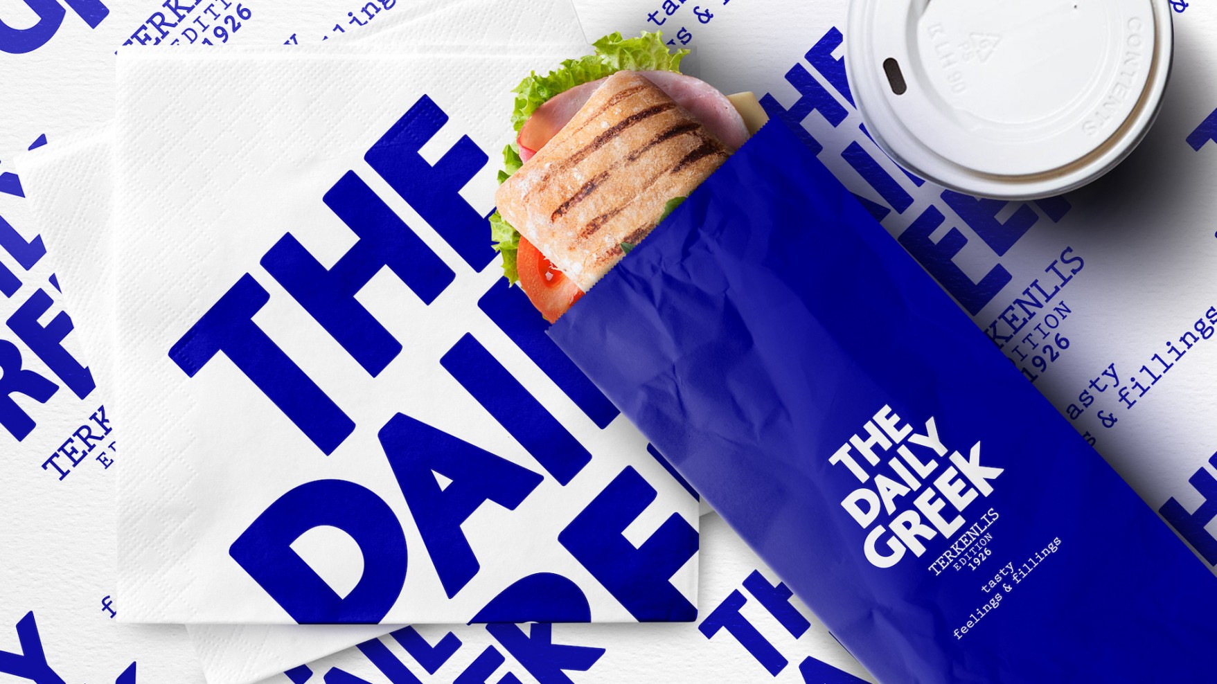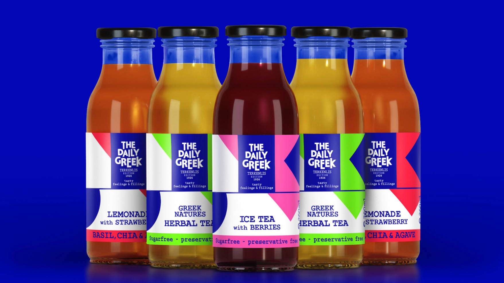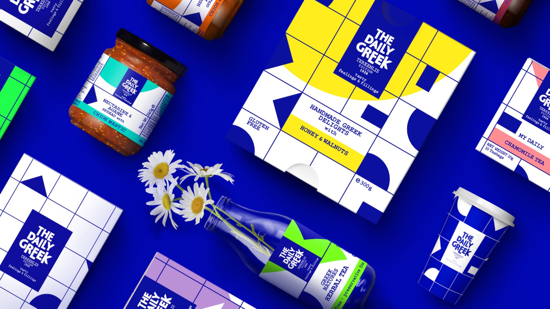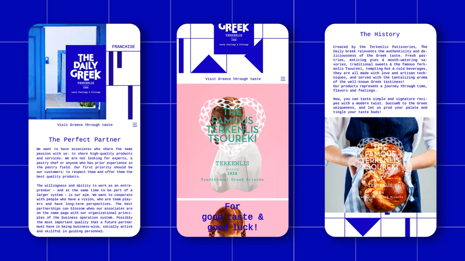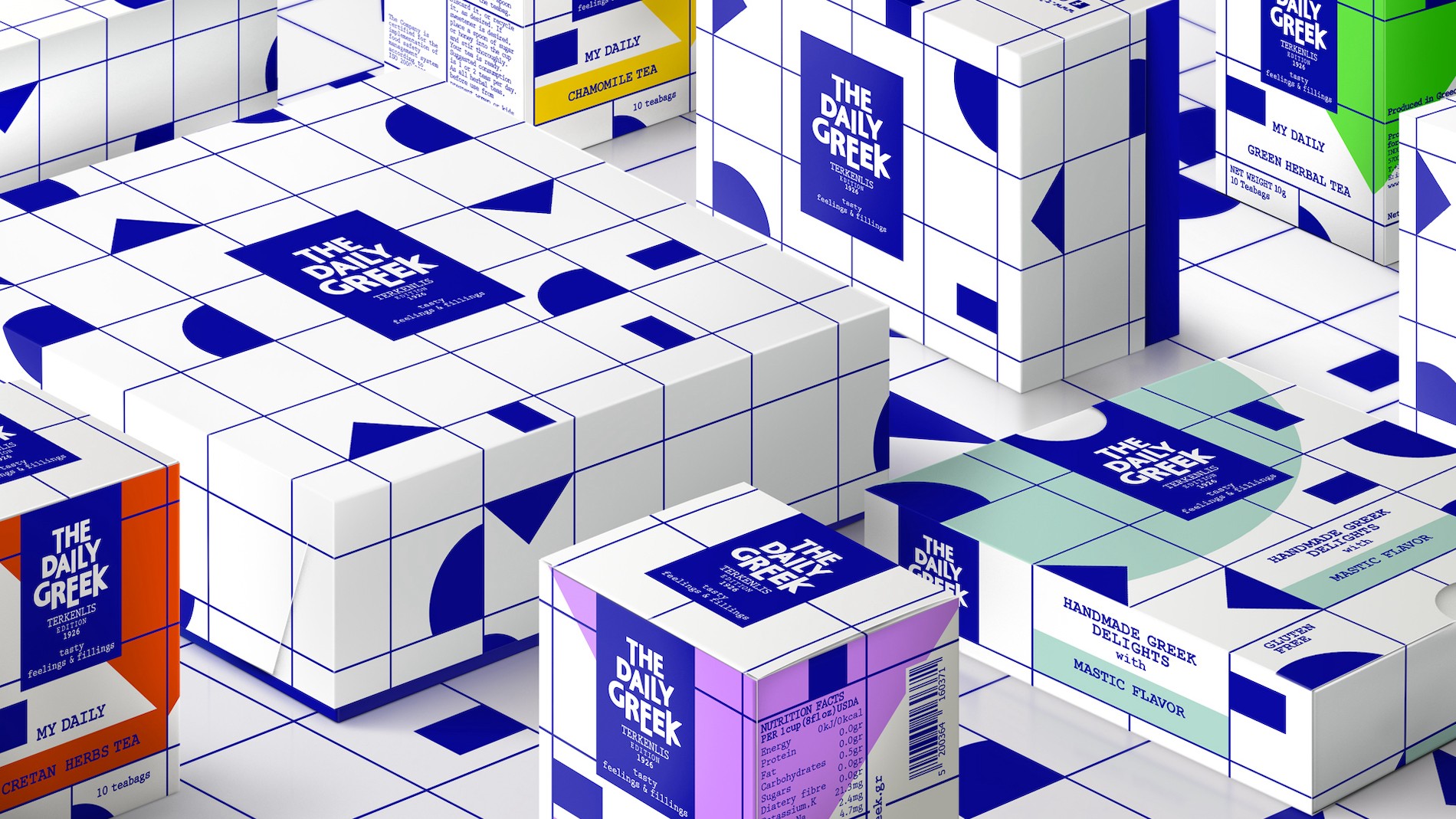


The deliciousness and variety of Greek flavours is a piece of culture which, when travels abroad, gains friends. When on top of that you add the signature of the famous Terkenlis, a brand with global resonance is born.
The identity of the brand is the identity of Greece itself. The Greece of unique flavours, but also of the one offering something new every day. Since news used to spread through newspapers, we named the brand Daily Greek. Like a tasty newspaper that transports culture, freshness and Greekness.
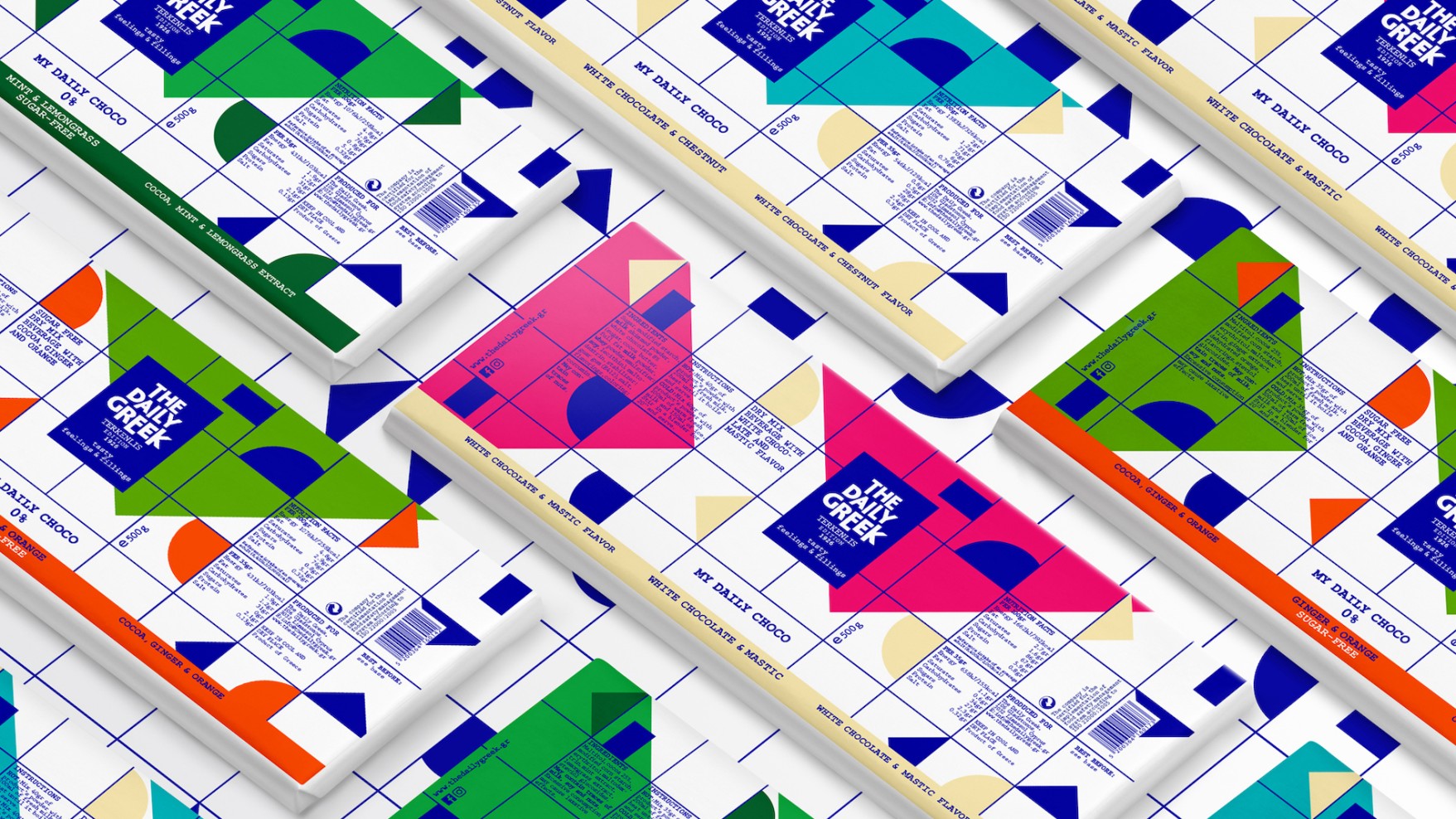
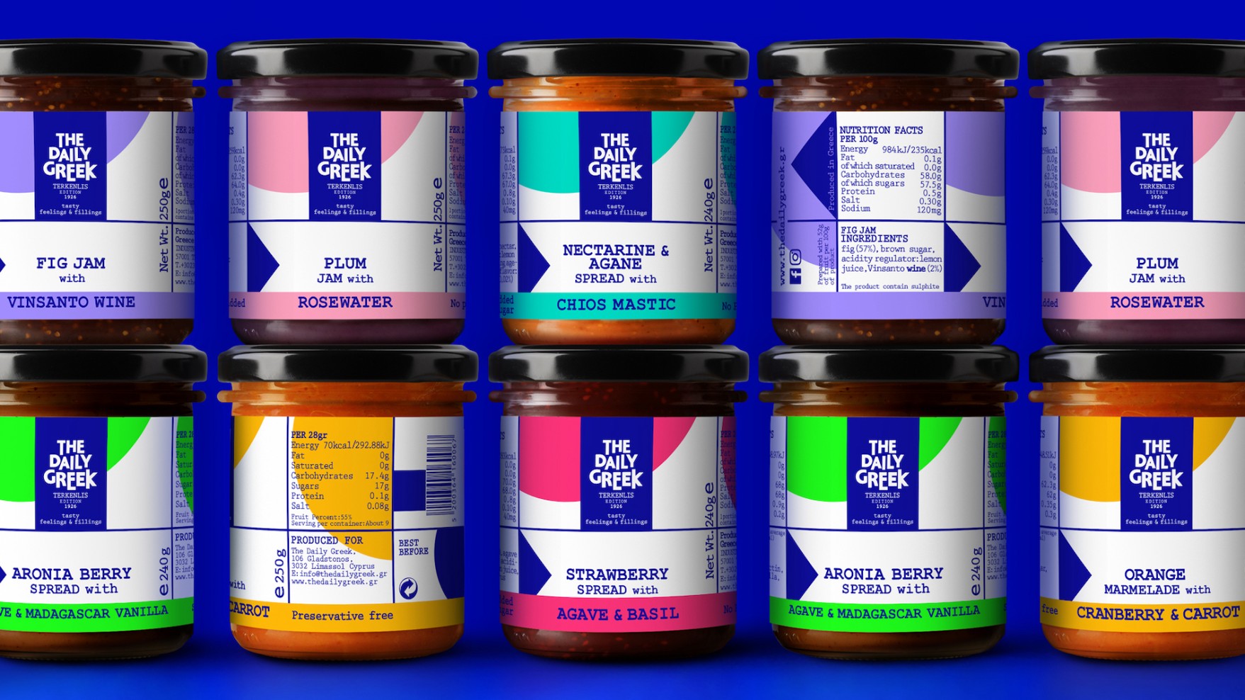
As basic pallet we chose our local colours. The white of the Cyclades and cadmium blue for its unique brightness. The secondary colours, also intense, also showered by Greek light, were added to differentiate the categories.
Our inspiration was Yannis Moralis and his geometric motifs which are built with simple and controlled gestures. Nothing is left to chance. The essence of the motif, Greek-centred, unfolds rhythmically. With continuous, almost obsessive repetition, it mirrors Greek pluralism. The visual concept creates a dialectic antithesis between shapes and colours.
The Greek element becomes even more emblematic thanks to the font, which is inspired by minimalism and the frugal design of ancient epigraphs on marble and stone.
The brand photographs the land of blue and white. Of geometry and logic. Of the linear script and minimalist thought. Of good food and pure ingredients. It’s a Greece that not everyone can visit but everyone can taste.
| 2019 | FAB Awards | Silver Award | Retailers |
| A’ Design Awards | Silver Award | Packaging Design | |
| Packaging Awards | Silver Award | Packaging of Products Launched in a new International Market |
